Asian Way of Map Label Placement | 우리식의 지도 레이블 표현
As I am a cartographer
(at least, that how I call my self),
I think POI and labels (fonts) are more important than basemap.
Let’s say the basemap looks legit.
Yet, the labels and POI markers (or icons) are bad,
then the MAP does not look alright. (which is obvious)
No matter how much time you spent to make the basemap,
the awful labels (or fonts) will contaminate the overall map design
(I used the word ‘contaminate’, because it really does).
Therefore, cartographers should spend a lot of time into POI and its assembled parts (font, color, icon, marker, and so forth).
I, however, am color blind and not trained as a typographer, making maps with good readability is somewhat challenging.
So, what I did was going to a library and read books about typography (or font in my term) and chromatics (or coloring in my term).
But this is not enough to make myself to be a unique cartographer.
I thought about what makes me different among all cartographers in the world.
When I was in college in the U.S.,
(I guess Asians are no longer unique these days, but they were in up north Minnesota)
I, sometimes, was being focused in my department.
So, I guess I better use the ‘Asian’ card in cartographers’ world.
What I tried was researching the ‘Asian’ way of geography (풍수지리),
also known as Feng Shui (in Chinese).
Mostly, the Asian way of geography is focused on location-allocation,
such as ‘Where is the best location for my ancestors’ graveyard’ or ‘Where is the best location for a house’
But, I decided to do ‘how to implement Asian way of thoughts in making maps’.
One of my favorite countries, Japan, still a lot of people are reading books in vertically/right to left.
I thought about how I am going to apply that Japan’s unique reading method to maps.
Because cartographers duties are not only making maps for the generals, but the locals.
Glocalization is probably the most required condition for cartographers, I believe.
Also, understanding the target country’s culture and custom is the key to drag to successful map service.
Anyway, these are few of my philosophies about making maps.
Again, as I am a ‘Asian’ cartographer, who were educated in the U.S., better readability and more information comes first.
But, I am also considering how I am going to mingle with Asian culture with westernized cartography methods, along with GIS knowledge.
Well, it seems like Mapbox already did that for me.
Today, Mapbox did the experiment with vertical label placement in Tokyo, Japan.
When this API comes for the public, I will monkey around and post it.
Additionally, I am sharing the difference of making maps of the East and the West.
I, personally, think Asian maps had very BAD readability (or maybe that is because I do not know how to read Chinese character, Kanji).
I have to say I am not condescending Asian cartographers,
for in the past western maps also did not have any concepts of projections and others.
But, this is the fact that Mercator did make a really awesome map (but I am not saying Mercator projection is perfect,
yet Web-Mercator projection is my favorite)
and at the end, the Europeans conquered the world until the world war II.
| Mecator’s Map in 14 C | Old Korean Map in 14 C |
|---|---|
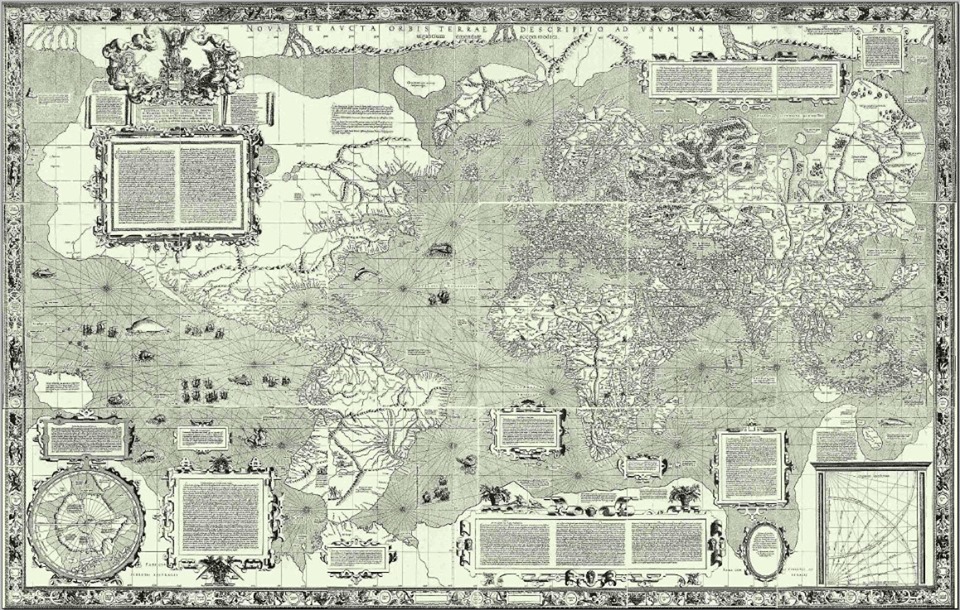 |
 |
Anyway, thanks Mapbox for a new toy.
—
June 25th,
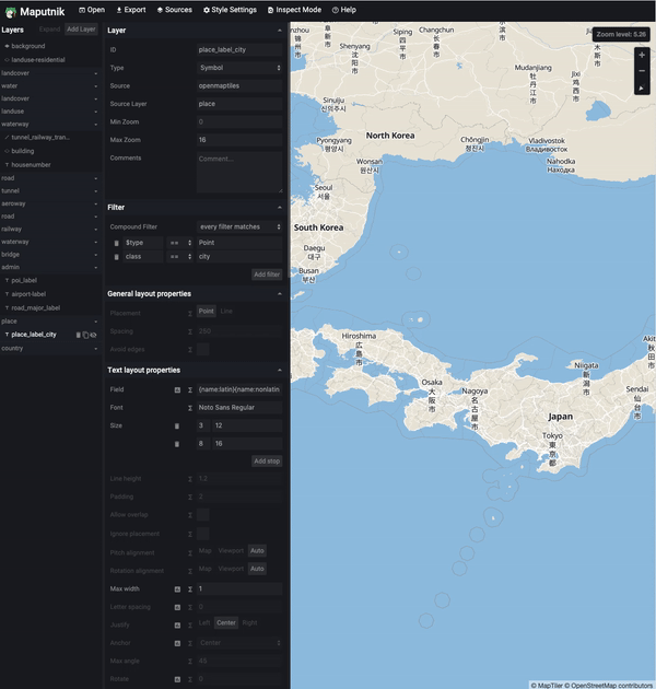
I was playing with Mapbox studio and found out, as of right now,
Mapbox does support vertical placement label.
It is a little trick that you just change Max Width to 1
Here, I attached a video of how I did.
Korean doesn’t seem to be working with this trick but Chinese/Japanese are working well
한국어 버전
지도 제작자로써 (적어도, 저는 저를 그렇게 부르고 있습니다.),
POI와 레이블 (폰트)는 지도보다 더 중요하다고 보고 있습니다.
Basemap이 아무리 잘 만들어있어도,
레이블과 POI의 마커(아이콘)이 정말 별로이면, 일반 사용자들은 지도를 좋게 평가할 수 없죠.
지도 제작자가 시간을 얼마나 퍼부었는지 중요하지 않습니다.
나쁜 디자인의 레이블과 좋은 Basemap이 만나는 순간 지도는 오염될 수 밖에 없죠. (까마귀 노는곳에 백로야 가지마라. 미꾸라지 한마리가 물을 더럽힌다?)
따라서, POI와 이에 따른 부분들 (폰트, 색상, 아이콘, 마커, 등등)은 중요합니다.
그렇지만 저는 색신이상에 타이포그래피를 배워본적도 없는 사람이기에 가독성이 높은 지도를 만드는것은 항상 힘듭니다.
그래서 도서관에가서 해당 서적을 읽고 공부를 하지만,
저를 특별한 지도제작자로 만들기엔 충분하지 않습니다.
제가 최근 공부?연구?하는것은 동양의 지리학 (즉, 풍수지리)입니다.
물론 입지선정에 초점이 맞추어져있진 않습니다. 동양의 사상?생각을 어떻게하면 지도에 넣을 수 있을까? 입니다. (물론 지도제작이라는 학문 자체는 서양에서 온 문물입니다만..)
제가 좋아하는 나라중에 하나인 일본은 아직도,
우리의 예전 풍습처럼 오른쪽에서 왼쪽, 위에서 아래로 읽는 문화가 만연해있습니다.
저는 이를 어떻게 일본지도 혹은 일본을 좋아하는 사람들을 위한 지도에 가져올 수 있을까를 고민했습니다.
왜냐하면, 지도제작자에게는 일반인을 위한 지도를 고려해야하지만
지역주민을 위한 지도도 함께 고려해야하는 의무가 있으니까요.
Glocalization, 이것이 아마 제일 중요한 것일겁니다.
그리고 지도제작의 타겟이 되는 나라의 문화/풍습을 이해하는것도 성공적인 지도제작에 필요한 키입니다.
어쨋든, 위의 것들이 제가 지도를 만들때 고려하는 철학입니다.
다시한번, 저는 서양에서 공부한 (동양의) 지도제작자로써 가독성과 정보전달이 높은 지도에 관심이 많습니다.
그렇지만, GIS 방법을 이용하여 어떻게 동양의 문화를 서양의 지도 제작방법과 융합할 수 있을지 고민합니다.
Mapbox가 그 고민을 해결해 준 듯 합니다.
오늘 Mapbox가 세로 방향의 레이블 표현실험을 블로그에 남겼는데요 아래에 스크린샷이 있습니다.
API가 공개되면 실험 을 좀 해본뒤에 결과물을 공유하도록 하겠습니다.
추가로, 동/서양의 지도 제작 차이법을 공유드립니다.
개인적으로 동양의 지도의 가독성은 매우 좋지 않았다고 생각합니다 (어쩌면 제가 한자를 읽지 못해서 일지도 모릅니다).
우리 문화를 낮춰보려고 하진 않습니다,
왜냐하면 과거에는 좌표계등의 컨셉이 없었기 때문이죠.
하지만, Mercaotors가 정말로 멋진 지도를 만든것은 사실이고 (제가 Web-Mercator의 좌표계를 최애하지만, Mercoator의 좌표계가 완벽하다는 것은 아닙니다.)
그의 지도로 유럽사람들이 세계를 지배한것은 사실이니까요.
| Mecator’s Map in 14 C | Old Korean Map in 14 C |
|---|---|
|
|
아무튼, 새로운 장난감을 선사해주신 Mapbox에게 감사드립니다.
—
6월 25일,
오늘 Mapbox studio를 갖고 놀아봤습니다.
우연찮게도 세로 쓰기를 지원하더군요.
Max Width 를 1로 줄이는 약간의 꼼수를 부려보았습니다.
제가 어떻게 했는지 비디오를 첨부합니다.
한국어는 이 꼼수로는 적용되지 않아 보입니다만, 일본어와 중국어는 잘 적용되어 보입니다.